
19 departamentos y 1 sola identidad: El desafío detrás de OdontoRed
Cuando un servicio tiene un impacto a nivel nacional, la marca debe estar a la altura de esa responsabilidad. En Puro Diseño trabajamos el proyecto integral de naming y diseño de identidad para OdontoRed (Cooperativas Odontológicas Federadas del Interior), la red de asistencia en salud bucal más grande de Uruguay.
Con 27 cooperativas operando en todo el país, el objetivo estratégico desde Puro Diseño fue claro: crear un ecosistema visual que respirara calidad, ética profesional y la garantía de un servicio dedicado al paciente.
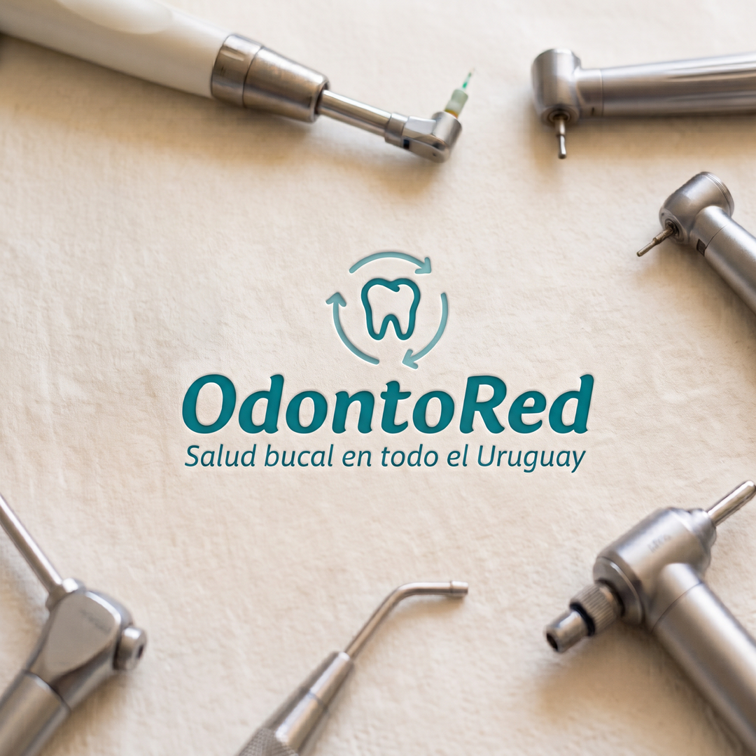
El mayor reto era traducir gráficamente sus dos grandes diferenciales: la excelencia médica y una respuesta activa las 24 horas en todo el territorio nacional. Para lograrlo, el isotipo se construyó sobre dos niveles de lectura complementarios:
El centro del cuidado: una representación gráfica clara de la protección bucal.
El dinamismo envolvente: que simboliza esa respuesta permanente, activa y siempre disponible para quien lo necesita.
-----
19 Departments, 1 Single Identity: The Challenge Behind OdontoRed
When a service has a national impact, the brand must rise to that level of responsibility. At Puro Diseño, we developed the comprehensive naming and brand identity project for OdontoRed (Cooperativas Odontológicas Federadas del Interior), the largest oral healthcare network in Uruguay.
With 27 cooperatives operating nationwide, our strategic goal at Puro Diseño was clear: to create a visual ecosystem that exudes quality, professional ethics, and the guarantee of patient-centered service.
The greatest challenge was to graphically translate its two main differentiators: medical excellence and an active 24-hour response across the entire country. To achieve this, the isotype was built upon two complementary layers of meaning:
The core of care: A clear graphic representation of oral protection.
The enveloping dynamism: Symbolizing a permanent and active response, always available to those who need it.